How to compare data
Tables, pictograms, and charts are some of the tools you can use to compare data.
They can be used to answer questions you have about the information you have.
They can also be used to help you think of new questions about the information.
Different tables and charts use different approaches to displaying data:
- a table can include numbers or tallies
- a bar chart has bars or blocks
- a pictogram includes pictures, shapes or symbols
It is important to always check the scale of the chart, pictogram or table so that you are sure what number is being shown.
Activity: Comparing data
Complete this interactive activity to learn how to compare data. Then put your knowledge to the test.
Using tables and charts
Comparing data means looking at information to see what is similar or different about it.
Displaying data in a table or chart can help you to compare it.
Take a look at three examples of different charts or tables that you can use.
Data table
This data table shows how many flowers were planted in a garden. The different numbers of flowers can be easily compared by reading the table.
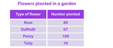
This data table shows that 109 pansies were planted - this is the highest number of flowers planted.
You can also use it to find out that 67 daffodils were planted - this is the lowest number of flowers planted.
Pictogram
This pictogram uses pictures to represent numbers. It shows the favourite fruits of children at a school.
Pictograms will always have a scale, which will tell you how much each image represents.
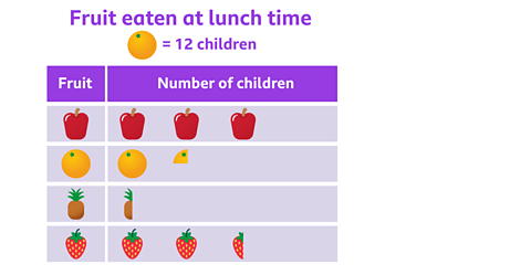
In this pictogram, each piece of fruit represents 12 children. Half a piece of fruit represents 6 children. A quarter of a piece of fruit represents 3 children (because 3 is a quarter of 12).
You can use this pictogram to compare data and find out that 6 children chose pineapple and 36 children chose apple.
Bar chart
A bar chart uses bars to show data. This bar chart shows the favourite sports of children in Class 4.
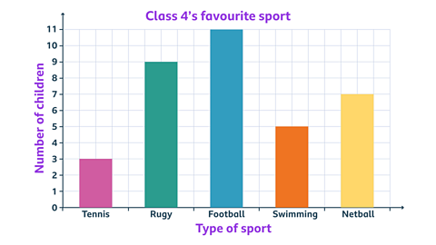
The height of each bar on this bar chart shows how popular something is.
You can quickly use this bar chart to compare data and find out that football was the most popular sport (it has the tallest bar in the chart).
You can also use it to find out that tennis was the least popular sport (it has the smallest bar in the chart).
Example 1
This is a data table that shows how many trains travelled from a station over a week.
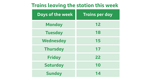
On which day did the most trains travel from the station?
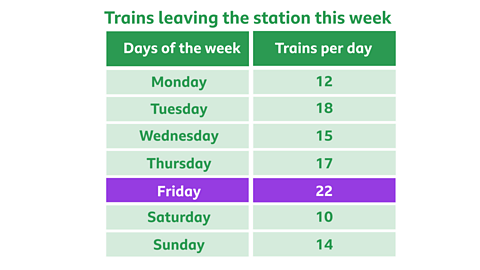
✓ Friday was the day when the most trains travelled from the station.
To work this out, look at the numbers in the 'Trains per day' column. Which is number is the greatest?
The greatest number is 22.
The day with 22 trains per day is Friday.
Example 2
This is a pictogram which shows how many books were borrowed from the library.
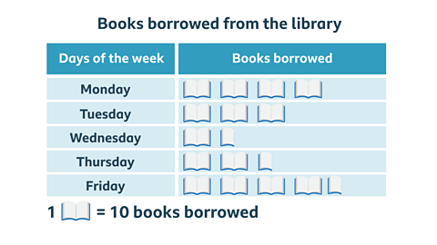
How many more books were borrowed on Monday than on Wednesday?
Don't forget to look at the scale.
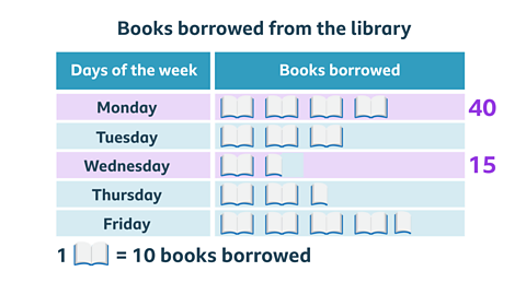
✓ 25 more books were borrowed on Monday.
The pictogram shows 4 full book images for Monday. For Wednesday, it only shows 1 full book image and 1 half book image.
Each full book image represents 10 books. So, 4 full books mean 40 books were borrowed on Monday.
1 full book means 10 books, and the half book means 5 books. Together, that’s 15 books borrowed on Wednesday.
30 books were borrowed on Monday and 15 books were borrowed on Wednesday.
40 - 15 = 25
So, 25 more books were borrowed on Monday.
Example 3
This is a bar chart that shows how many people visited different rooms in a museum.
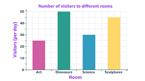
This is a bar chart that shows how many people visited different rooms in a museum.
Which room was the least popular?
✓ The art room was the least popular, with 25 people visiting it.
You can say this because the bar for the art room is the smallest bar in the chart. The data shows 25 people visited the art room.
Play Guardians: Defenders of Mathematica to get ready for SATs. game
In this game, use the times tables and more maths skills to defeat monsters and reclaim the Kingdom.

More on Tables, graphs and charts
Find out more by working through a topic
- count4 of 7

- count5 of 7
- count6 of 7

- count7 of 7